Overview
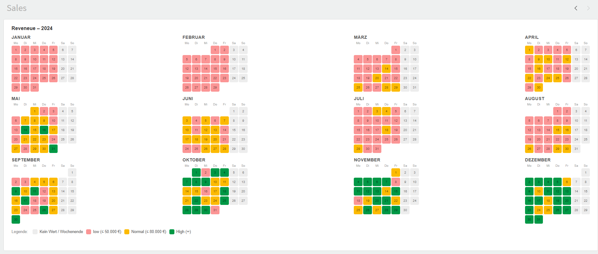
The Heatmap Calendar is a Qlik Sense visualization extension that renders the daily values of a measure across a full year as a color-coded calendar. Each day is colored by a configurable value tier, so highs, lows and gaps stand out at a glance.
Example
Video
What it does
- Shows all 12 months of a chosen year as compact day-grids (Monday-first weeks).
- colors each day according to its measure value, using color tiers you define.
- Marks today with an outline.
- Shows a tooltip (date, value, tier) on hover and lets you select a day with a click.
- Displays a legend explaining every color.
- Fully bilingual property panel and labels (English / German).
Quick start
- Drag Heatmap Calendar from the assets panel onto a sheet.
- Add one Dimension = your date field.
- Add one Measure = the value to visualise (e.g.
Sum(Sales)). - Open Settings › Period and set the Year you want to display.
- Adjust the color tiers to match your value range.
Data
| Slot | Count | Description |
|---|---|---|
| Dimension | exactly 1 | The date of each data point. |
| Measure | exactly 1 | The numeric value used to color the day. |
Supported date formats: a real date field works out of the box (the normal
case — just use your date dimension). Dates stored as text are also recognized
when written as YYYY-MM-DD, DD.MM.YYYY, or MM/DD/YYYY.
Days that have no data — or a value of 0 or less — are drawn in the empty
color. Only days that actually exist in the data can be selected.
Make sure the dimension is a real date field so values land on the correct calendar day. If the dates arrive as text, use one of the formats above.
Aggregation & data volume
The calendar draws one cell per day, so it expects one row per day in the
data. Qlik aggregates the measure for each value of the date dimension, so as long
as the dimension is at day granularity, each day is summed up on its own (e.g.
Sum(Sales) becomes the total for that day).
If your date field is a timestamp (it carries a time part such as
2024-05-01 14:33:12), every distinct timestamp counts as its own value. The
rows for one day are then not merged — the day cell shows only a single
reading instead of the daily total, and the extra rows quickly eat into the
limit below. Always reduce timestamps to a plain date first.
Reduce a timestamp to a day
In the load script (recommended) — aggregate to one row per day before the chart ever sees the data. This is the fastest option for large models:
DailySales:
LOAD
    Date(Floor([OrderTimestamp])) AS [OrderDate],
    Sum([Amount])                 AS [DailyAmount]
RESIDENT Orders
GROUP BY Date(Floor([OrderTimestamp]));
In the chart dimension (quick fix) — wrap the timestamp so the dimension itself collapses to whole days. Use this expression as the dimension:
=Date(Floor([OrderTimestamp]))How much data is loaded
The extension reads up to 3,000 daily rows in one fetch and does not page through more. At day granularity that is roughly 8 years of data — far more than a single calendar year needs, so a properly aggregated date dimension never comes close to the limit. You only approach it when raw timestamps inflate the row count, which is one more reason to aggregate to day level.
Interactions
- Hover a day to see a tooltip with the full date, the measure value (with unit) and the tier label.
- Click a day to select that date in Qlik; click again to toggle it off. Selections combine, so several days can be selected at once.
- Today is drawn with a dark outline.
- The legend (bottom) lists the empty color plus every tier with its threshold.
For the full property-panel reference, see Settings.