Overview
The LeitArt Data+ Table Extension allows Qlik Sense users to enter data directly in their App. It offers most of the Qlik table chart options (sorting, selecting, searching, etc.), but adds several new features, most importantly:
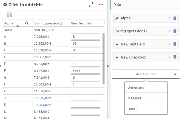
Other key features include:
- Data+ fields update in real time, users can see data changes instantly
- A powerful Rule editor allowing you to design your table the way you need it
- Creating your own tables
- Access to reload tasks for all users
- Calculations
- A wide array of styling options, including custom HTML
How does it work
The extension creates a websocket connection to the Data+ Server. User input is send to the server and saved in a PostgreSQL Database . Each Data+ Table can connect to a different database table. The row identifier setting determines the unique id for the table. Other extension object with the same table and equal row identifiers will show the same data, updating in real time.
Upon opening a Data+ Table, all displayed row identifiers are checked for their additional Data+ Data. If the identifier matches the database table id, the values will be available (displayed) in the row. If the row identifier has no matched id, the database entry will be created, once any additional Data+ data is saved for the identifier.
Server compatibility
Required server versions:
| Extension version | Data+ Server |
|---|---|
| 2.2.0+ | 1.18.0+ |
| 1.34.0+ | 1.13.0+ |
| 1.32.0+ | 1.11.0+ |